Components
The Linkita theme providers multiple components.
Never heard of components? See Zola documentation for more information.
Mermaid component
To use Mermaid in your page, you have to set extra.mermaid = true in the frontmatter of page.
+++
title = "Your page title"

[extra]
mermaid = true
+++
Then you can use the <mermaid> component like:
{% <mermaid> %}

graph TD;
A-->B;
A-->C;
B-->D;
C-->D;

{% </mermaid> %}
This will be rendered as:
graph TD;
A-->B;
A-->C;
B-->D;
C-->D;
In addition, you can use code block inside <mermaid> components and the code block will be ignored.
The code block prevents formatter from breaking mermaid's formatting.
{% <mermaid> -%}

```mermaid
sequenceDiagram
    participant Alice
    participant Bob
    Alice->>John: Hello John, how are you?
    loop Healthcheck
        John->>John: Fight against hypochondria
    end
    Note right of John: Rational thoughts <br/>prevail!
    John-->>Alice: Great!
    John->>Bob: How about you?
    Bob-->>John: Jolly good!
```

{%- </mermaid> %}
This will be rendered as:
sequenceDiagram
    participant Alice
    participant Bob
    Alice->>John: Hello John, how are you?
    loop Healthcheck
        John->>John: Fight against hypochondria
    end
    Note right of John: Rational thoughts
prevail!
    John-->>Alice: Great!
    John->>Bob: How about you?
    Bob-->>John: Jolly good!
Admonition
The <admonition> component displays a banner to help you put notice in your page.
You can use the component like:
{% <admonition type="tip" title="tip"> %}
The `tip` admonition.
{% </admonition> %}
The admonition component has 12 different types:
The note admonition.
The abstract admonition.
The info admonition.
The tip admonition.
The success admonition.
The question admonition.
The warning admonition.
The failure admonition.
The danger admonition.
The bug admonition.
The example admonition.
The quote admonition.
Gallery
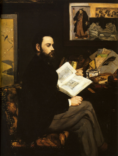
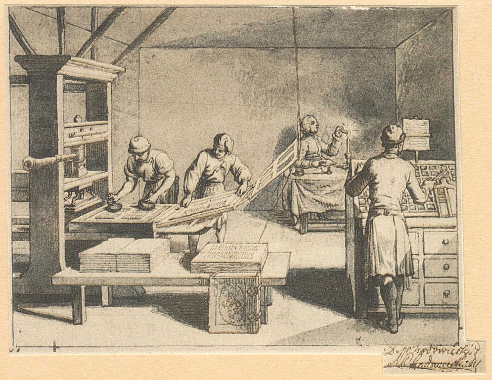
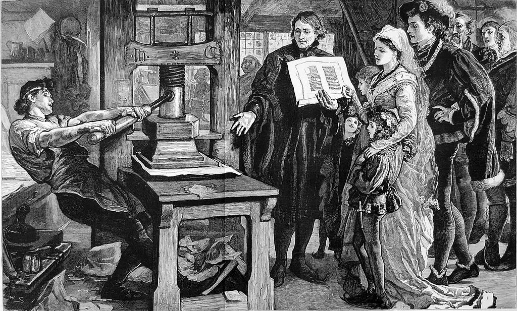
The <gallery /> component is very simple html-only clickable picture gallery that displays all images from the page assets.
It's from Zola documentation
{{ <gallery /> }}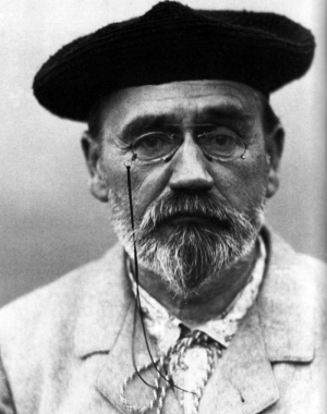
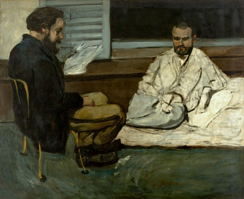
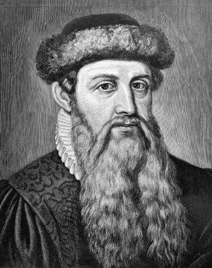


Projects
The <projects /> component allows you to make a page for your projects.
Create a content/pages/projects/index.md file:
+++
title = "My Projects"
description = ""
path = "projects"
+++

{{ <projects path="data.toml" format="toml" /> }}
Create a content/pages/projects/data.toml file:
[[project]]
name = "lorem"
desc = "Lorem ipsum dolor sit."
tags = ["lorem", "ipsum"]
links = [
    { name = "homepage", url = "https://example.com" },
    { name = "source", url = "https://example.com" },
]
This will be displayed as: